
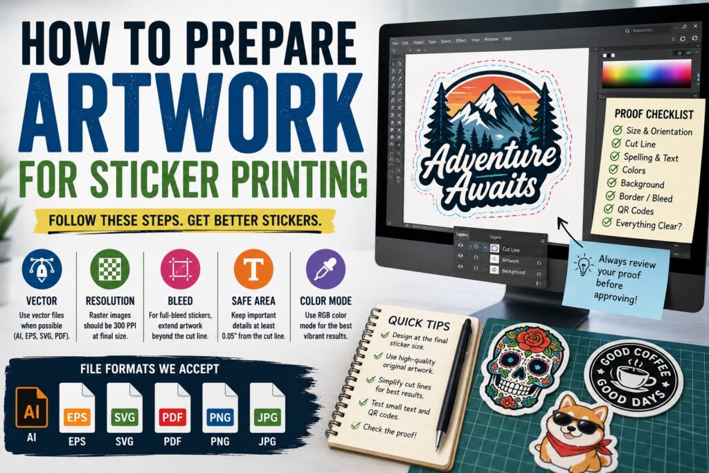
TLDR
Prepare sticker artwork at the final intended size and use a resolution of 300 PPI when working with pixel-based images. Vector files are ideal for logos, text, and simple illustrations because they can be resized without becoming blurry.
Keep important details at least 0.05 inches inside the cut line. For full-bleed stickers, extend the artwork beyond the intended edge so small cutting variations do not expose unprinted vinyl.
Review the sticker proof carefully. Check the size, spelling, cut shape, border, background, and placement before approving it.
A design can look sharp on a phone and still print as a blurry sticker.
Screens hide many artwork problems. Small text appears larger when you zoom in. Low-resolution logos may look acceptable at thumbnail size. A white background can be mistaken for transparency. And a cut line that seems obvious to the designer may not be obvious to the person preparing the file for production.
Knowing how to prepare artwork for sticker printing helps prevent those problems before the order reaches the press. It also gives you more control over the final sticker shape, border, color, and level of detail.
You do not need to be a professional designer to create a usable sticker file. Start with the intended size, use the best-quality original artwork available, leave room for cutting, and explain anything that is not obvious.
Start With the Final Sticker Size
Design the artwork at the size you plan to order whenever possible.
A 2-inch sticker and a 5-inch sticker may use the same design, but they do not present the same printing challenges. Text that is readable at 5 inches may disappear at 2 inches. Fine lines may become too delicate. Small gaps can close up. A border that looks balanced on a large canvas may feel heavy after the artwork is reduced.
At CustomStickers, the selected sticker size refers to the longest side of the finished sticker. A 3-inch horizontal sticker will be approximately 3 inches wide, while a tall design will be approximately 3 inches high. The other dimension changes according to the artwork’s proportions.
Before submitting the file:
- Set the artboard or canvas to the intended print size.
- View the design at 100 percent.
- Print a paper sample at actual size.
- Check whether the text can be read without zooming.
- Look for thin spaces that may close when printed.
- Confirm that the design still works from a normal viewing distance.
A paper printout will not reproduce the exact color or material of a finished vinyl sticker. But it is excellent for judging size, spacing, text, and overall composition.
Use Vector Artwork When Possible
Vector artwork is built from mathematical paths rather than a fixed grid of pixels. That means it can be enlarged or reduced without losing edge quality. Common vector formats include AI, EPS, SVG, and some PDFs.
Vector files are especially useful for:
- Logos
- Typography
- Icons
- Line drawings
- Simple illustrations
- Geometric shapes
- Cut lines
- QR codes
A vector logo can be used for a 1-inch label or a large window graphic without becoming pixelated. A small JPG version of that logo cannot.
But saving a low-resolution image inside an AI, SVG, or PDF file does not automatically turn it into vector artwork. The placed image is still made from pixels. The file extension changed, but the artwork did not.
CustomStickers accepts vector files such as SVG, AI, and EPS, as well as high-resolution raster images such as PNG and JPG.
Use 300 PPI for Raster Images
Photos, digital paintings, scanned artwork, and many illustrations are raster images. Raster files contain a fixed number of pixels, so their print quality depends on both resolution and physical size.
CustomStickers recommends submitting raster artwork at 300 PPI at the final print size. Adobe also identifies 300 PPI at final output size as the preferred resolution for professional print graphics.
The phrase at final size matters.
A 900-pixel-wide image can print at:
- 3 inches wide at 300 PPI
- 6 inches wide at 150 PPI
- 12.5 inches wide at about 72 PPI
The pixel count has not changed. You are simply spreading those pixels across a larger area.
Do not enlarge a small screenshot and then change the resolution box to 300 PPI without adding real image detail. That changes the file’s metadata or creates interpolated pixels, but it cannot fully recover details that were never present.
Use the original artwork whenever possible. Avoid files downloaded from social media, copied from a website thumbnail, or captured in a screenshot.
Understand the Difference Between DPI and PPI
PPI means pixels per inch and describes the resolution of a digital image at a certain physical size.
DPI means dots per inch and usually describes the output of a printer.
People often use the terms interchangeably in casual print discussions. For artwork preparation, the practical concern is whether the raster file contains enough pixels for the intended sticker size.
A 300 PPI image at full size is a reliable target for detailed sticker printing.
Choose the Right File Format
CustomStickers can work with virtually any common file format, but some formats are easier to review and reproduce accurately than others. The company recommends high-resolution PNG or JPG files and vector formats such as SVG, AI, and EPS. Customers preparing their own production file can also upload a PDF.
| File Format | Best For | Main Consideration |
|---|---|---|
| AI | Editable vector artwork and custom cut lines | Make sure linked images are included |
| EPS | Logos and traditional vector artwork | Some modern transparency features may be limited |
| SVG | Simple vector graphics and logos | Review effects, masks, and embedded images |
| Finished print-ready artwork | Confirm size, resolution, fonts, and transparency | |
| PNG | Raster artwork with transparency | Export at 300 PPI at final size |
| JPG | Photos and flat artwork without transparency | Compression can create visible artifacts |
| PSD | Layered raster artwork | Keep full resolution and include all needed layers |
| TIFF | High-quality raster artwork | File sizes may be large |
A PNG is usually better than a JPG when the design needs a transparent background. JPG files do not preserve transparency, so blank areas are typically filled with white.
A PDF is often the cleanest delivery format for advanced artwork because it can preserve vector paths, embedded images, fonts, transparency, and page dimensions. Adobe notes that print-ready PDFs should contain appropriate resolution, color handling, and embedded fonts.
Do Not Confuse White With Transparent
A white background and a transparent background are not the same thing.
If a design has a white rectangle behind it, that rectangle may become part of the printed sticker. If the background is transparent, the design can be cut around its actual outer shape or printed on a specialty material without the unwanted rectangle.
Transparency is particularly important for:
- Die-cut character stickers
- Logos without a background
- Clear stickers
- Holographic stickers
- Chrome stickers
- Designs intended for a custom contour cut
Most design programs represent transparency with a gray-and-white checkerboard. But the safest approach is to reopen the exported file and confirm that the background remains transparent.
For standard white vinyl stickers, white areas in the artwork can use the white vinyl as their base. On specialty materials, the underlying material may show through areas that do not receive white ink. CustomStickers notes that clear stickers commonly use white ink beneath colored areas to improve opacity, though transparent stickers may still appear lighter than designs printed on white vinyl.
Decide Between a Border and Full Bleed
The edge treatment changes the look of the finished sticker.
Sticker With a Border
A border creates a visible area between the artwork and the cut edge. White is the most common choice, but borders can use another color when it suits the design.
Borders are helpful when:
- The artwork has an irregular shape.
- Fine details extend near the outside edge.
- The design needs separation from the surface underneath.
- The sticker will be placed on a dark or busy background.
- You want a classic die-cut sticker appearance.
CustomStickers adds a small border around artwork by default unless the customer requests full bleed.
Full-Bleed Sticker
Full bleed means the printed design continues all the way to the finished edge.
Small variations occur during cutting, so the artwork needs to continue beyond the exact cut position. Otherwise, a slight shift may expose a thin strip of unprinted vinyl.
CustomStickers creates full-bleed stickers by bringing the cut line approximately 0.03 inches inside the artwork. Important text, faces, logos, and other critical details should not sit on the outer edge.
Full bleed works well for:
- Photographs
- Background patterns
- Solid-color designs
- Rectangular labels
- Artwork intended to feel edge-to-edge
Neither option is universally better. Choose the edge treatment that fits the design.
Keep Important Artwork Inside the Safety Margin
The safety margin is the space between the cut line and important design elements.
CustomStickers recommends keeping at least 0.05 inches between the cut line and the design when working with a border.
Keep these elements inside the safety area:
- Text
- Logos
- Faces
- QR codes
- Thin outlines
- Small icons
- Important portions of an illustration
Background colors and textures can extend beyond the cut line for full bleed. Important content should stay comfortably inside it.
A safety margin does not mean the cutting equipment is inaccurate. It accounts for normal production variation and prevents tiny shifts from becoming visible mistakes.
Simplify Complicated Cut Shapes
Die-cut stickers can follow the contour of artwork, but not every tiny bump needs to become part of the cut line.
An overly complicated contour can create:
- Fragile points
- Narrow pieces
- Hard-to-peel sections
- Awkward backing shapes
- Areas likely to catch or lift after application
- A sticker that looks rough rather than intentional
Smooth the outer contour and remove small interior notches that do not add much to the design.
Rounded transitions generally hold up better than long, narrow spikes. Small gaps between nearby parts of the artwork may also be better connected into one larger sticker shape.
The cut path should capture the overall silhouette rather than tracing every hair, leaf, spark, or rough brush texture.
Add a Custom Cut Line Only When Needed
You do not need to create your own cut line for a standard order. CustomStickers automatically adds one, and the online proof shows how the sticker will be cut.
Advanced users can provide a custom vector path.
CustomStickers recommends separating the file into:
- An Artwork layer containing the printed design
- A Cut Line layer containing the vector path
The cut line can be created by vectorizing the outer shape, offsetting the path, and converting it to a stroke.
Use one clean, closed vector path. Avoid placing several conflicting outlines around the same design.
If you include a custom cut line, make it obvious that the path is a production guide rather than an element that should print. A clearly named layer prevents confusion.
Check Fine Lines and Small Text
Tiny details that look elegant on a large monitor can disappear when printed at sticker size.
CustomStickers recommends a minimum fine-detail line weight of 0.5 point. The company lists 4-point type as its smallest supported font size and recommends at least 6 points for better readability.
Those values are production limits, not automatic design targets.
A simple sans-serif font may remain readable at a smaller size than a delicate script. White text reversed out of a dark background may need more weight. Text printed over a photograph may need additional contrast.
Before ordering:
- View the file at actual size.
- Check scripts and thin serif fonts carefully.
- Increase spacing between small letters.
- Avoid hairline strokes.
- Add contrast behind text.
- Print a paper sample.
The question is not only whether the printer can reproduce the text. The customer also needs to be able to read it.
Use RGB for CustomStickers Artwork
Many traditional print guides tell designers to convert every file to CMYK. That is not the preferred workflow for every digital printer.
CustomStickers accepts RGB or CMYK artwork but generally recommends RGB. Its printing setup uses an extended range of inks, and keeping the file in RGB allows the production workflow to preserve a wider color gamut before conversion.
RGB is particularly useful for preserving vivid:
- Blues
- Greens
- Oranges
- Gradients
- Digital illustrations
- Bright brand colors
This does not mean every screen color can be reproduced exactly in print. Screens create color with light, while printed stickers use physical ink on a material. Very bright or luminous colors may shift when printed. Material choice, laminate, surrounding colors, and monitor calibration also affect how the result appears.
Keep an editable master file. Do not repeatedly convert the same image back and forth between RGB and CMYK, since each conversion can alter color values.
Design for the Actual Sticker Material
The same artwork can look different on white vinyl, clear vinyl, holographic film, chrome, or glitter material.
White Vinyl
White vinyl provides a consistent base and usually produces the strongest, most predictable color.
Clear Vinyl
Clear material allows the application surface to affect the design. Colored ink is naturally translucent, so a white underbase may be used to improve opacity. Even with white ink, colors on clear material may appear lighter than they do on white vinyl.
Holographic, Chrome, and Glitter
Specialty effects show through unprinted or intentionally transparent areas. Dark, high-contrast designs often control these materials better than pale artwork with many subtle details.
Decide which portions should print as color, which should print with white ink, and which should allow the material to show through. Do not leave this open to interpretation when the effect is important.
Embed Images and Preserve Fonts
Editable design files may depend on external image links and font files.
If an Illustrator document contains linked artwork that is not included with the uploaded file, the production team may see a missing image. Adobe’s Embed Images function stores the placed artwork inside the Illustrator document rather than relying on the original file’s location.
Before sending an editable file:
- Embed linked images.
- Confirm no links are missing.
- Outline fonts in a duplicate production file or export a print-ready PDF with fonts embedded.
- Keep the original editable file with live text.
- Remove hidden draft elements.
- Delete unused artboards when they could create confusion.
Always save a separate editable master before outlining text. Once letters have been converted into vector shapes, ordinary text editing becomes harder.
Prepare Photos Carefully
Photos can make strong stickers, but they need enough contrast and resolution.
Before uploading a photo:
- Use the original image rather than a social media copy.
- Crop out unnecessary background areas.
- Brighten dark faces and shadow details.
- Check skin tones.
- Remove distracting objects near the intended cut line.
- Avoid placing the cut too close to hair or hands.
- Add a border when the subject needs separation.
A phone photo may contain plenty of pixels for a small sticker. The more common problem is poor lighting, motion blur, aggressive compression, or a subject that does not separate clearly from the background.
Do not use artificial sharpening as a substitute for a focused photograph. Heavy sharpening can create bright halos and rough edges that become more visible in print.
Test QR Codes Before Printing
A QR code needs sharp edges, strong contrast, and clear space around it.
Use a vector QR code when possible. Keep the light border around the code intact and avoid placing illustrations, textures, or cut lines too close to the modules.
Before ordering:
- Print the artwork at final size.
- Scan it with more than one phone.
- Test it under ordinary indoor lighting.
- Confirm the destination page is correct.
- Make sure the web address will remain active.
- Scan the final proof again.
A QR code that scans at 6 inches wide on a monitor may not scan after being reduced to half an inch.
Review Every Word
Sticker printing makes spelling mistakes permanent in bulk.
Check:
- Business names
- Website addresses
- Social handles
- Phone numbers
- Dates
- Coupon codes
- Product names
- Ingredients
- Measurements
- Legal wording
- QR code destinations
Read the text aloud. Then ask someone who did not create the design to check it.
Designers often overlook errors because they already know what the text is supposed to say.
Inspect the Proof at Actual Size
The proof is the last clear opportunity to catch problems before printing.
CustomStickers’ proof process shows the intended cut line and allows customers to request revisions before approval. Once a proof is approved and production begins, changes may no longer be possible.
Review:
- Finished size
- Cut shape
- Border thickness
- Full-bleed treatment
- Artwork orientation
- Background removal
- White ink placement
- Text and spelling
- Quantity and material
- Matte or gloss finish
- Areas where the cut approaches important details
Do not review only the large preview image. Compare the listed dimensions with the object where the sticker will be used.
A proof can show a beautiful 3-inch sticker when you actually needed a 3-inch-wide label that was only 1 inch tall. The proportions matter.
Common Sticker Artwork Mistakes
Uploading a Screenshot
Screenshots often contain fewer pixels than the original artwork and may include interface elements or compression.
Enlarging a Small Logo
A small raster logo becomes softer as it is enlarged. Request the original vector file from the designer when possible.
Leaving an Unwanted White Box
Remove the background or clearly state that the white rectangle should remain.
Putting Text on the Cut Edge
Move important wording inside the safety margin.
Using Extremely Thin Lines
Increase stroke weights and test the design at actual size.
Sending Multiple Conflicting Versions
Upload the final version and name it clearly. Archive earlier drafts rather than placing all of them in one folder.
Assuming the File Name Is an Instruction
A file named logo_sticker_final_full_bleed_v7_USE_THIS_ONE.png is helpful, but checkout notes and clearly prepared artwork are better.
Ignoring the Proof
The proof is not a ceremonial step. It shows the planned size and cut.
Print-Ready Sticker Artwork Checklist
Use this checklist before uploading:
- Artwork is set to the intended sticker size.
- Raster images are 300 PPI at final size.
- Logos and text are vector when possible.
- The correct file version is being submitted.
- The background is intentionally transparent or solid.
- Important details stay at least 0.05 inches from the cut line.
- Full-bleed artwork extends beyond the intended edge.
- Fine lines are at least 0.5 point.
- Important text is readable at actual size.
- RGB color mode is used for the CustomStickers workflow.
- Linked images are embedded.
- Fonts are embedded or converted appropriately.
- Specialty-material transparency is clearly identified.
- QR codes have been tested at final size.
- Spelling and contact information are correct.
- The proof will be reviewed before approval.
Final Thoughts
Preparing artwork for sticker printing is mostly about making decisions before production has to guess.
Choose the final size. Use vector artwork or a 300 PPI raster file. Decide whether the sticker needs a border or full bleed. Keep important elements away from the cut line. Test small text, QR codes, and fine details at actual size.
And review the proof carefully.
CustomStickers can work with many file types and help prepare artwork for production, but a clean source file gives you more control over the result. Better artwork does not merely make the printing process easier. It produces sharper text, smoother edges, clearer colors, and a sticker that looks like the design you intended.