
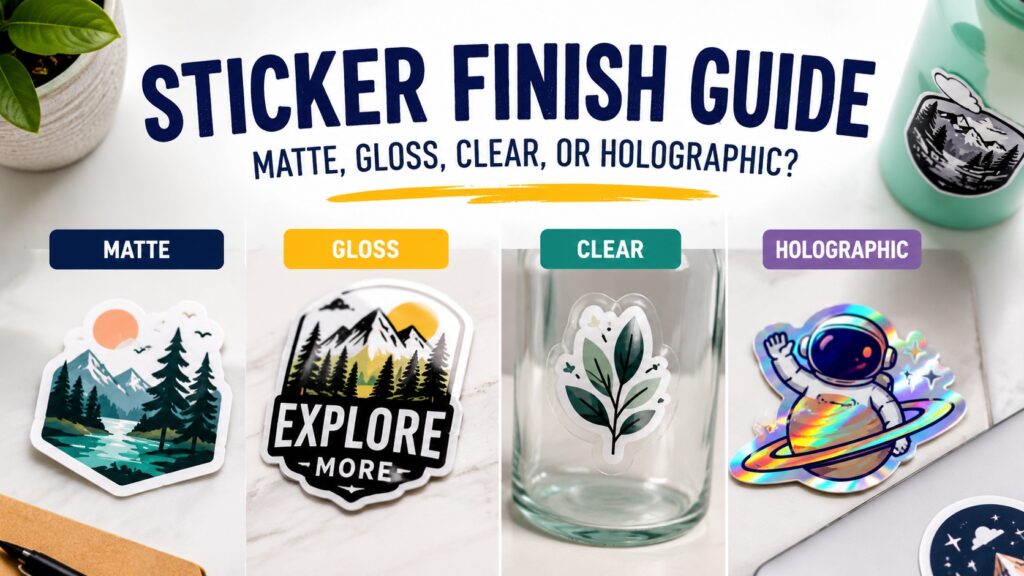
TLDR
- Choose gloss if you want bright color, shine, and a classic sticker look.
- Choose matte if you want a softer finish with less glare and easier readability.
- Choose clear stickers when you want the surface underneath to show through.
- Choose holographic stickers when the sticker is merch, a giveaway, or part of a bold visual brand.
- The best sticker finish depends on the design, surface, lighting, and how the sticker will be used.
A sticker finish can change the whole feel of a design. The same logo can look bold and bright with gloss, quiet and polished with matte, clean and minimal on clear vinyl, or loud in a good way on holographic material.
That is why a sticker finish guide is useful before you order. The finish is not just a style choice. It affects color, glare, texture, readability, and how people perceive the sticker. A good finish helps the design do its job without making the customer think too hard about it.
What a Sticker Finish Actually Changes
A sticker finish is the outer look and surface feel of the sticker. In most cases, this comes from the material, the laminate, or both. The finish can make colors look more saturated, reduce glare, add shine, create transparency, or reflect light.
That may sound like a small detail. It is not.
A glossy sticker on a water bottle feels energetic and familiar. A matte sticker on a candle box feels quieter and more refined. A clear sticker on glass can look like it was printed directly on the surface. A holographic sticker can turn simple art into something that feels collectible.
This sticker finish guide is less about choosing the “best” finish and more about choosing the finish that matches the job.
Quick Sticker Finish Comparison
Use this chart as a starting point.
| Finish | Best For | Main Strength | Tradeoff |
|---|---|---|---|
| Gloss | Bold logos, outdoor stickers, water bottles, cars, colorful art | Bright color and shine | Can create glare |
| Matte | Packaging, text-heavy designs, subtle branding, photo-style art | Softer look and easier readability | Colors may feel less punchy |
| Clear | Glass, windows, bottles, minimalist labels | Surface shows through | Needs contrast to stay readable |
| Holographic | Artist merch, giveaways, launches, bold designs | Reflective rainbow effect | Can compete with busy artwork |
The best choice usually becomes obvious once you know where the sticker will go.
Choose Gloss for Bright Color and Classic Sticker Energy
Gloss is the finish most people picture when they think of a sticker. It has a shiny surface, strong color, and a clean laminated look. It is a great choice when you want the design to stand out.
Gloss works especially well for:
- Brand logos
- Colorful artwork
- Laptop stickers
- Water bottle stickers
- Outdoor gear
- Car window stickers
- Event giveaways
- Sports teams and school decals
Gloss tends to make colors feel brighter because the surface reflects more light. That can help bold designs, mascot art, food illustrations, and high-contrast logos feel more alive.
The tradeoff is glare. In bright light, a glossy sticker can reflect light back at the viewer. For most designs, that is fine. For small text, QR codes, or detailed information, matte may be easier to read.
If you want a classic custom sticker that works across many uses, die cut stickers are a strong place to start. They can follow the shape of your artwork, which makes them useful for logos, characters, badges, and merch.
Choose Matte for a Softer, Cleaner Look
Matte stickers have less shine. They feel more subtle and tend to reduce glare. That makes matte a good fit for designs where readability matters or where the brand should feel calm and polished.
Matte is often a smart choice for:
- Product packaging
- Candle labels
- Coffee bags
- Skincare branding
- Art prints and illustration merch
- Text-heavy stickers
- Minimalist logos
- Wedding and event packaging
- Stickers that need to photograph well
Matte can make colors feel slightly softer. That is not a flaw. It is the point. A matte finish can make a design feel less loud and more intentional.
For brands that use muted colors, simple typography, or natural packaging, matte usually feels right. It also helps when the sticker will be viewed under store lights or photographed for online listings.
If you are still comparing matte and gloss, CustomStickers has a useful matte vs glossy stickers breakdown that focuses on color, glare, and common use cases.
Choose Clear Stickers When the Surface Matters
Clear stickers use transparent material, so the surface underneath becomes part of the design. This can create a clean “printed-on” look, especially on glass, plastic, bottles, jars, windows, and smooth packaging.
Clear stickers work well for:
- Window decals
- Bottle labels
- Jar labels
- Minimal logos
- White ink designs
- Product packaging
- Tech accessories
- Designs with open space
The main thing to watch is contrast. A black logo on a clear sticker may look great on a light surface, but it can disappear on a dark bottle. A white design can look clean on glass, but it may not show clearly on white packaging.
Clear stickers are best when you already know the surface color. If customers may place the sticker anywhere, standard white vinyl is usually safer because the design has its own background.
For packaging and window-style designs, transparent custom stickers can give the final product a cleaner look without adding a visible white border or background.
Choose Holographic for Merch and High-Impact Designs
Holographic stickers reflect rainbow colors in the light. They are not quiet. That is why people like them.
A holographic finish is a good choice for:
- Artist merch
- Limited drops
- Band stickers
- Gaming stickers
- Festival giveaways
- Bold logos
- Simple icon art
- Kids’ brands
- Outdoor lifestyle designs
- Designs with large open areas
Holographic material works best when the design gives the effect room to show. If every inch of the design is packed with tiny detail, the holographic shine may get lost. Simple shapes, strong outlines, bold lettering, and open backgrounds usually work better.
One good approach is to test a proven design as a holographic version. If a standard sticker already sells well, a holographic version can feel like a special edition.
For art drops, merch tables, and promotional giveaways, custom holographic stickers are a good way to make a design feel more collectible without changing the artwork itself.
Match the Finish to the Surface
The surface matters almost as much as the artwork.
A gloss sticker on a cooler or water bottle makes sense because the sticker will be handled, seen outdoors, and exposed to changing light. A matte sticker on a kraft mailer or candle box may fit better because the product itself has a softer look.
Here is a simple way to think about it:
| Surface | Good Finish Options | Why |
|---|---|---|
| Laptop | Gloss, matte, holographic | Most finishes work well |
| Water bottle | Gloss, holographic, clear | Durable and visually strong |
| Glass jar | Clear, matte, gloss | Depends on label style |
| Candle box | Matte, gloss | Matte feels subtle, gloss adds color |
| Car window | Gloss, clear | Visibility matters |
| Product pouch | Matte or gloss | Depends on brand style |
| Art merch table | Gloss, holographic, sticker sheets | Easy to browse and buy |
There is no universal rule. A bright candy brand might want gloss labels. A handmade soap brand might want matte labels. A brewery might use clear labels on glass bottles. A tattoo artist might choose holographic stickers for flash-inspired artwork.
The finish should support the design, not fight it.
Think About Sticker Format Too
Finish is one decision. Format is another.
A single logo sticker may work best as a die cut sticker. A set of tiny illustrations may make more sense as a sheet. Product labels are often easier to apply from a roll, especially when you are labeling dozens or hundreds of items.
For small designs, custom sticker sheets can make the product feel complete. They are useful for artists, planners, teachers, small shops, and anyone selling themed sticker sets.
For packaging, sticker rolls are usually easier to store and apply in larger quantities. That matters when you are labeling jars, bags, boxes, bottles, or mailers.
The same artwork can feel different in each format. A 2-inch logo as a die cut sticker feels like a giveaway. The same logo on a roll feels like packaging. The same logo on a sheet feels like part of a set.
Use the Design Style as Your Guide
The design itself will often tell you which finish fits.
Choose gloss if the design has:
- Bright colors
- High contrast
- Bold outlines
- Playful energy
- Outdoor use
- A classic sticker feel
Choose matte if the design has:
- Small text
- Fine details
- Muted colors
- Soft illustration
- Minimalist branding
- A more refined product look
Choose clear if the design has:
- Open space
- Strong contrast
- A surface-specific purpose
- Simple logo marks
- Packaging or window use
Choose holographic if the design has:
- Thick outlines
- Simple shapes
- Large unprinted areas
- A merch or collector angle
- A design that can handle extra shine
This is one of those choices where “cool” is not always the same as “right.” A holographic sticker can look great, but it may not be the best choice for a delicate skincare label. A matte sticker can look polished, but it may not have enough pop for a band merch table.
Common Sticker Finish Mistakes
The first mistake is choosing a finish before thinking about the surface. A finish that looks great on a screen may not work as well on glass, metal, plastic, cardboard, or a curved bottle.
The second mistake is using clear stickers without enough contrast. Clear vinyl can look clean, but the design still needs to be readable.
The third mistake is making holographic artwork too busy. The material already adds movement and color, so the design needs enough breathing room.
The fourth mistake is using tiny text on a glossy sticker that will be viewed in bright light. Gloss can look great, but glare can make small details harder to read.
The fifth mistake is assuming matte is always “premium” and gloss is always “basic.” That is too simple. Gloss can look polished and professional. Matte can look flat if the artwork needs more punch. The right finish depends on the job.
A Simple Finish Decision Checklist
Before ordering, ask these questions:
- Will the sticker be used indoors or outdoors?
- Does the design need to be read quickly?
- Is the artwork colorful or muted?
- Will the sticker be photographed for online listings?
- Is the sticker going on glass, plastic, metal, paper, or packaging?
- Should the sticker feel subtle, bold, clean, or collectible?
- Is this a single sticker, a sheet, or a label roll?
- Does the design need a white background, clear background, or special effect?
If you are unsure, choose the finish that makes the design easier to understand. A sticker can be beautiful, but it still needs to communicate.
FAQs
What is the best sticker finish overall?
There is no single best sticker finish. Gloss is best for bright color and shine. Matte is best for a softer look and lower glare. Clear is best when the surface should show through. Holographic is best when you want a special effect.
Are matte or glossy stickers better for packaging?
Matte is often better for soft, minimal, or text-heavy packaging. Gloss is often better for colorful packaging that needs more shine and contrast. Both can work depending on the brand.
Do clear stickers work on dark surfaces?
Clear stickers can work on dark surfaces if the design has enough contrast. White ink or light-colored artwork can help. Dark artwork on a dark surface may be hard to see.
Are holographic stickers good for business branding?
Holographic stickers can be good for business branding when the brand is bold, creative, playful, or event-focused. They may be less appropriate for brands that need a quiet or minimal look.
Should artist merch use matte or gloss stickers?
Both can work. Gloss is strong for colorful character art, bold illustrations, and outdoor-style designs. Matte is better for soft art, muted palettes, and designs with fine details. Holographic can work well for special editions.
Conclusion
The right sticker finish depends on the design, the surface, and the purpose. Gloss gives you shine and strong color. Matte gives you a softer look with less glare. Clear vinyl lets the surface show through. Holographic material adds movement, color, and a collectible feel.
Use this sticker finish guide as a practical filter before ordering. Start with where the sticker will go. Then look at how much detail the design has, how readable it needs to be, and what feeling the brand should create.
A finish is a small choice that can make a sticker feel finished. And when the finish matches the design, the sticker usually looks more intentional from the first glance.